Charts
Contents
Overview
The Fusion Data Browser offers charting and tabulation capabilites to visulaise the series selected from the Series List page. There are three main categories of visualisations:
- Time Series Chart - Providing a view of series values over time
- Tabulation of Data - Providing a view of all series in a pivot table
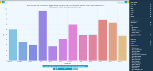
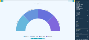
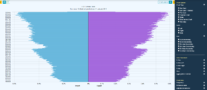
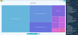
- Cross Sectional Charts - Providing a view of a data sliced for a single time period and aggregated for one or more dimensions (example charts: Bar/Pie/Treemap/Pyramid)
Charts can be given dynamic lables which update as the data being charted changes, static lables, or a mixture of the two. Charts can also be saved locally, or shared as URL or embedded link.
General chart configuration is part of the Data Browser set up.
Dynamic Labels
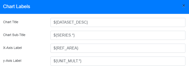
Dynamic Labels enable values to be picked from the metadata for the dataset, HTML markup can be used, as well as a mix of static content with the dynamic content.
The syntax places varaibles within the ${...} characters, where the ... is replaced with the ID of the Component, for example ${FREQ} would output the word 'Frequency' if the Concept FREQ had the label Frequency. ${FREQ.*} outputs the reported value for Frequency which could result in the Label 'Annual' if the data being displayed is reported against the Annual Frequency Code. the .* is used to indicate 'all code lables for component' so, if there are multiple values reported it will be displayed in a comma separated list, for example ${REF_AREA.*} could result in France, Germany, Poland if the data bring graphed is for three countries.
${T} is replaced with the Time Period or Range, if the chart is being displayed for a single time period, ${T} would be replaced with that time period '2015-Q1' for example. If the data is for a number of time periods, the ${T} is replaced by the range in the syntax 'start period / end period' for example '2015-Q1 / 2019-Q4'.
Time Series Chart
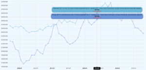
The Time Series Chart provides a view of series over time. All reported time periods are resolved to an absolute point in time, at the beginning of the period, for example an observation against the Annual period 2015 would resolve to 2015-01-01, which would be the same resolution as 2015-Q1 and 2015-01.
Regardless of the periods the data was reported against, the Time Series chart displays time in the X-Axis using the following syntax (note the date as it was reported can be displayed in the roll over bullet, this can be set up in the chart configuration)
- Annual - YYYY or MMM-YYYY (example Nov-2015)
- Monthly - YYYY-MM (example 2009-04)
- Daily - YYYY-MM-DD (example 2008-09-09)
For series with many thousands of data points, the time series chart can start to look messy and render slowly, however a group count can be applied to smooth out the line. Group count only plotting a subset of the data points, and when the chart is zoomed in to a smaller time period, it is re-renders to include more data points. The group count is defined in the chart configuration.
Time Series Specific Options
- Chart Type : Line Chart or Area Chart
- Add Scroll bars on both the X and Y axis
- Labels for X and Y Axis
- Legend Labels
- Override Bullet Labels
Pivot Table
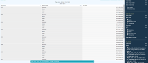
The Pivot Table provides a tabulation visulisation where the Dimension placement can be set to be part of the Header or Rows, and the order of each Dimension can be set. Like all other charts, a Dimension can be placed into the Slice, Dimensions can also be removed from the Chart data and Aggregated accroding to the choosen aggregation function.
Bar Chart
Pie Chart
Pyramid Chart
