Chart Configuration
Contents
Overview
The Chart Configuration is used to configure global properties for the Pivot Table and Time Series Chart.
The properties file is called chartconfig.json and is found in the properties folder. It will look something like this:
{
 "EmbedURL" : "https://myservver.org/fusionembeddedchart",
 "PivotTable" : {
   "ObsLimit" : 2000
 },
 "TimeSeries" : {
   "GroupCount" : 500,
   "SeriesLimit" : 20,
   "SeriesDisplay" : {
     "Default": "${REF_AREA}\n${SERIES} \n[bold]{sdmxdate}[/] \n[bold]{valueY}[/]",
     "ECB:EXR(1.0)": "${CURRENCY} [bold]to[/] ${CURRENCY_DENOM} \n[bold]{sdmxdate}[/]\n[bold]{valueY}[/]",
     "WB:GCI(1.0)" : "${REF_AREA} ${INDICATOR}\n[bold]{sdmxdate}[/] \n{valueY}",
   }
 }
}
Embed URL
Charts created in the Fusion Data Browser can be saved or shared as a URL. The URL will rebuild the chart exactly as it has been defined, with the same series and properties. The URL does not include the data; this is obtained from the server at the time the chart is generated. The Embed feature of the Fusion Data Browser requires a second application to be running. The EmbedURL provides the entry point to this application. [more details coming...]
Pivot Table Configuration
"PivotTable" : {
   "ObsLimit" : 2000
 },
The Pivot Table configuration is used to restrict how many observations can be put into the table at once, this is to prevent the table from becoming too large for the web browser to render. If a user tries to graph more observations, the data browser will automatically aggregate one or more of the Dimensions, allowing the user to using slicing, or inline query modications to bring the chart size back into the limit.
Time Series Configuration
Group Count
"GroupCount" : 500,
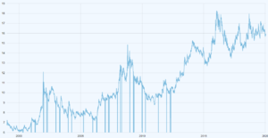
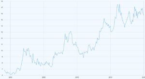
The Group count is used to prevent the time series chart from plotting every single data point on long time series. This can cause the chart to look messy, and contain far too much information for a user to meaningfully use.
The Group Count value indicates the maximum number of points to plot on a time series for the displayed range. When the user zooms into the chart, the time series will be refined to show more points.
It is possible to remove the Group Count by setting it to -1.
Series Limit
"SeriesLimit" : 20,
The Series Limit prevents a user from creating a Time Series chart with too many series. The limit can be unset by setting the value to -1, howver a time series chart with thousands of series will cause a web browser to become unresponsive as it tries to render the information, so a limit is recommended.
Series Display
 "Default": "${REF_AREA}\n${SERIES} \n[bold]{sdmxdate}[/] \n[bold]{valueY}[/]",
 "WB:GCI(1.0)" : "${REF_AREA} ${INDICATOR}\n[bold]{sdmxdate}[/] \n[red]{valueY}[/]",
The Series Display

