Difference between revisions of "Data Browser Time Series Chart"
(→Overview) |
(→Overview) |
||
| Line 20: | Line 20: | ||
[[File:FDB-TS-Chart1.png|1200px]] | [[File:FDB-TS-Chart1.png|1200px]] | ||
| − | + | Once selected, the Time Series chart will open, the example below is for '''Example - External Trade - all periods''' | |
| − | |||
| − | |||
| − | |||
| − | |||
| − | |||
| − | |||
| − | |||
| − | |||
| − | |||
| − | |||
| − | |||
| − | |||
| − | |||
| − | |||
| − | |||
| − | |||
| − | |||
| − | |||
| − | |||
| − | '''Example - External Trade - all periods''' | ||
Revision as of 23:37, 18 October 2024
This page is currently 'work in progress'.
Overview
A time series graph is a line graph that displays data over time to show trends or patterns. It's often used to visualize numerical values or counts, such as sales, measurements, or frequencies. Time series graphs can be used to make predictions about the future, such as financial growth or weather forecasting.
They are created by plotting an aggregated value (either a count or a statistic, such as sum or average on a time line. he values are aggregated using time intervals based on the time range in the data being plotted.
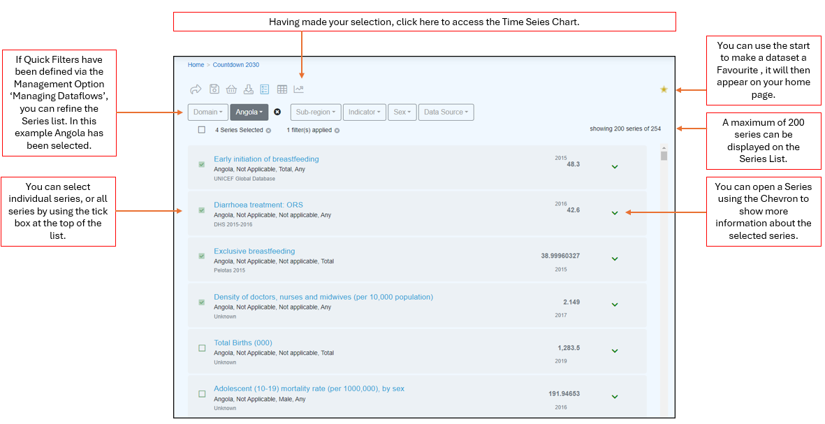
To access a Series Chart you need to open a Dataset in the Series List.
The Series List allows you to define what is to be included in the Time Series Chart.
Once selected, the Time Series chart will open, the example below is for Example - External Trade - all periods
You can use the Dataset Period button to refine the period displayed.
You can use the Table filters to reline the data included in the Time Series Chart.


