Difference between revisions of "Chart Configuration"
(→Text Variables) |
(→Style) |
||
| Line 123: | Line 123: | ||
| [bold]Text[/] || Outputs the 'Text' in Bold | | [bold]Text[/] || Outputs the 'Text' in Bold | ||
|- | |- | ||
| − | | [#00ff00]Green Text[/]! || | + | | [#00ff00]Green Text[/]! || Colours 'Green Text' green |
|- | |- | ||
| [font-size: 30px]Large Text[/] || Uses inline CSS to make the font-size large | | [font-size: 30px]Large Text[/] || Uses inline CSS to make the font-size large | ||
|} | |} | ||
Revision as of 05:39, 27 February 2020
Contents
Overview
The Chart Configuration is used to configure global properties for the Pivot Table and Time Series Chart.
The properties file is called chartconfig.json and is found in the properties folder. It will look something like this:
{
 "EmbedURL" : "https://myservver.org/fusionembeddedchart",
 "PivotTable" : {
   "ObsLimit" : 2000
 },
 "TimeSeries" : {
   "GroupCount" : 500,
   "SeriesLimit" : 20,
   "SeriesDisplay" : {
     "Default": "${REF_AREA}\n${SERIES} \n[bold]{sdmxdate}[/] \n[bold]{valueY}[/]",
     "ECB:EXR(1.0)": "${CURRENCY} [bold]to[/] ${CURRENCY_DENOM} \n[bold]{sdmxdate}[/]\n[bold]{valueY}[/]",
     "WB:GCI(1.0)" : "${REF_AREA} ${INDICATOR}\n[bold]{sdmxdate}[/] \n{valueY}",
   }
 }
}
Embed URL
Charts created in the Fusion Data Browser can be saved or shared as a URL. The URL will rebuild the chart exactly as it has been defined, with the same series and properties. The URL does not include the data; this is obtained from the server at the time the chart is generated. The Embed feature of the Fusion Data Browser requires a second application to be running. The EmbedURL provides the entry point to this application. [more details coming...]
Pivot Table Configuration
"PivotTable" : {
   "ObsLimit" : 2000
 },
The Pivot Table configuration is used to restrict how many observations can be put into the table at once, this is to prevent the table from becoming too large for the web browser to render. If a user tries to graph more observations, the data browser will automatically aggregate one or more of the Dimensions, allowing the user to using slicing, or inline query modications to bring the chart size back into the limit.
Time Series Configuration
Group Count
"GroupCount" : 500,
The Group count is used to prevent the time series chart from plotting every single data point on long time series. This can cause the chart to look messy, and contain far too much information for a user to meaningfully use.
The Group Count value indicates the maximum number of points to plot on a time series for the displayed range. When the user zooms into the chart, the time series will be refined to show more points.
It is possible to remove the Group Count by setting it to -1.
Series Limit
"SeriesLimit" : 20,
The Series Limit prevents a user from creating a Time Series chart with too many series. The limit can be unset by setting the value to -1, howver a time series chart with thousands of series will cause a web browser to become unresponsive as it tries to render the information, so a limit is recommended.
Series Display
 "Default": "${REF_AREA}\n${SERIES} \n[bold]{sdmxdate}[/] \n[bold]{valueY}[/]",
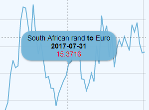
 "ECB:EXR(1.0)": "${CURRENCY} [bold]to[/] ${CURRENCY_DENOM} \n[bold]{sdmxdate}[/]\n[bold]{valueY}[/]",
The Series Display property enables a Global configuration of the tooltips shown when a user hovers over a time series line.
Without this setting, the label defaults to showing the series key, in the format A:UK:EMP, where A is the reported value in the first Dimension, UK the reported value in the second Dimension and so on.
The Series Display properties are the URN short code of a Dataflow, for example "ECB:EXR(1.0)" refers to a European Central Bank dataset for EXR (Exchange Rates) at version 1.0. The Default property can be defined to apply a label rule to any dataset that does not have a specific rule.
The Syntax includes variable placeholders for Dimension or Attribute values, dates, and observation values. Markup can be used to change the font styling or text. The following table shows the syntax:
Text Variables
| Syntax | Description |
|---|---|
| ${REF_AREA} | Replaced by the value of the Reference Area Dimension, in the Locale set on the Data Browser (or an alternative Locale if there is not one avalable in the requested Locale) |
| {sdmxdate} | Replaced by the date in SDMX format, as reported in the dataset. For example 2001-Q1. |
| {valueY} | Replaced by the reported observation value |
Observation Value Modifiers
| Syntax | Description |
|---|---|
| {valueY.formatNumber('###.00')} | @see AM Charts Formatting Numbers |
| {valueY.open} | First (open) Observation value for the series, within current selection. |
| {valueY.high} | Highest observation value for the series, within current selection. |
| {valueY.low} | Lowest observation value for the series, within current selection. |
| {valueY.close} | Last (close) observation value for the series, within current selection. |
| {valueY.sum} | Sum of all values in a series, within current selection. |
| {valueY.count} | Number data items in series, within current selection. |
| {valueY.average} | Average values in a series, within current selection. |
| {valueY.change} | Difference between series first and last value |
| {valueY.changePercent} | Difference between series first and last values in percent. |
| {valueY.previousChange} | Difference between value of current and previous items. |
| {valueY.previousChangePercent} | Difference between value of current and previous items, in percent. |
Style
| Syntax | Description |
|---|---|
| \n | New Line |
| [bold]Text[/] | Outputs the 'Text' in Bold |
| [#00ff00]Green Text[/]! | Colours 'Green Text' green |
| [font-size: 30px]Large Text[/] | Uses inline CSS to make the font-size large |


